
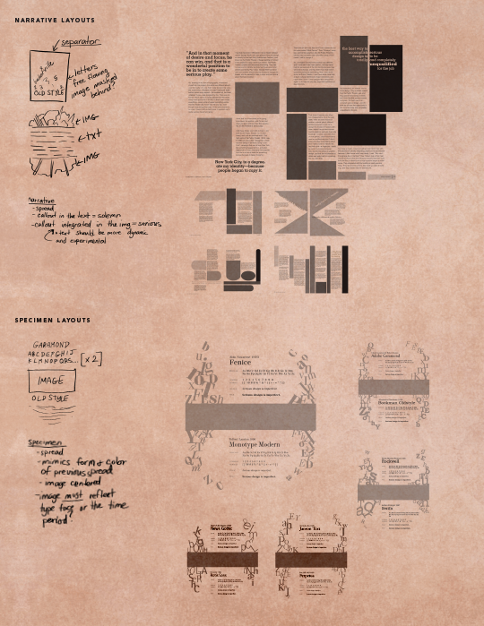
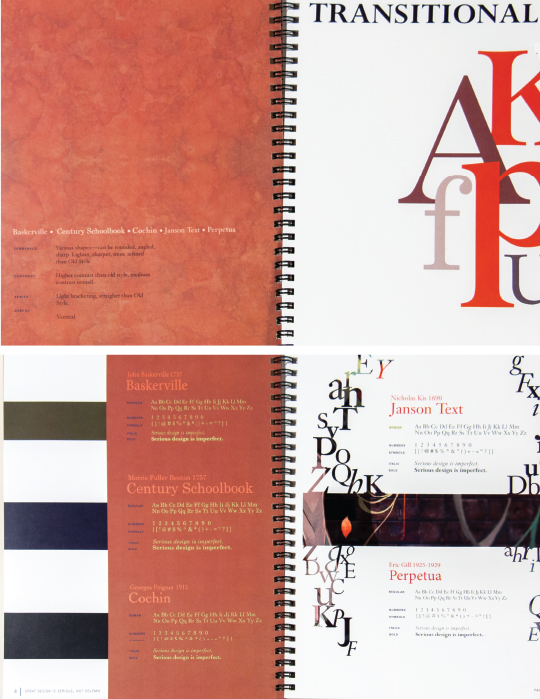
Narrative Specimen
Graphic Design | Typography | Fall 2014
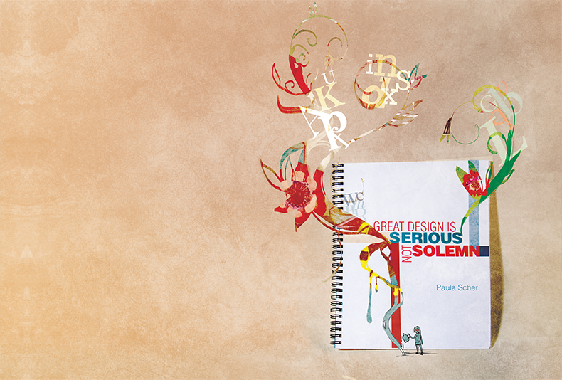
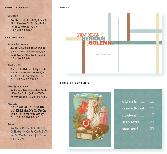
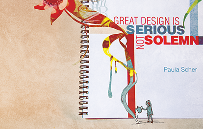
Great Design is Serious, not Solemn PDF
Serious is when we are making mistakes, when we are afraid, when we are learning, when we ware forced to try anything and everything. It is when we are experimental, and prone to failure. It is also when we come up with the wildest and most inspired ideas. Solemn is when we are accustomed, when we are perfecting, when we know what we need to do. It’s like a safe, well-worn path, and we are walking on autopilot. We are not engaged, and we aren’t learning anything new or inspired to try anything new.
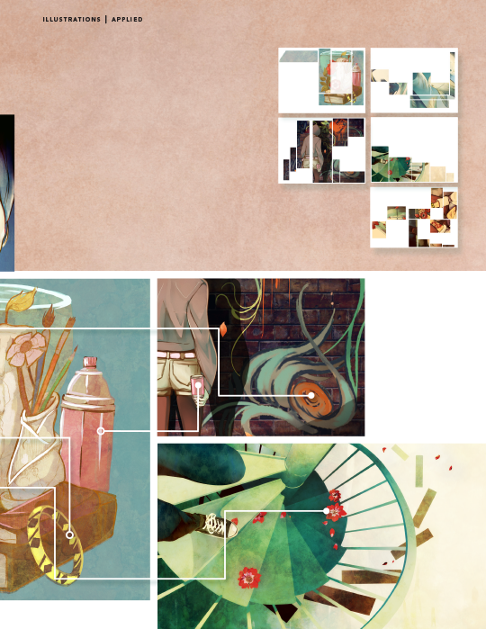
The goal of this project is to emphasize the idea of “serious vs. solemn” as it was explained by Paula Scher in her TED talk on design work. The concept is reflected via contrasting layouts within the narrative and specimen spreads using placement of images, text, and letterforms.
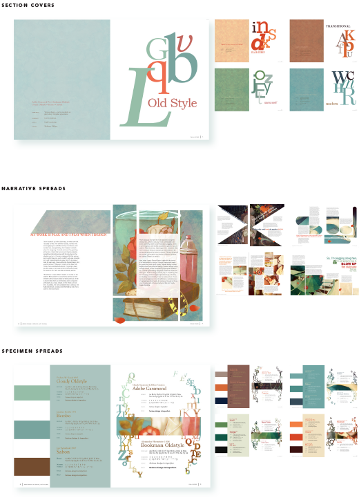
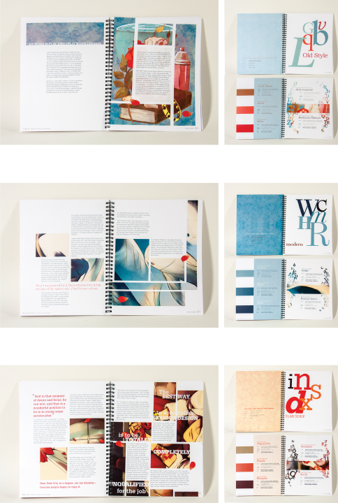
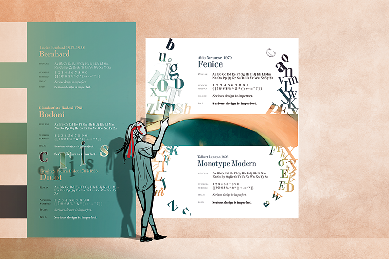
The left side of each spread represents “solemn” design and the right half represents “serious” design. The illustrations within are representative of solemn/serious design. The typeface for the running text was specifically chosen to be Helvetica, particularly because of Scher’s frequent mention of the typeface as well as her dislike for its overrated-ness.